Cubby

It started with my towels and ended up managing our home.

We kept medicine timings and class schedules in Telegram, trip details in emails, and washing routines mostly in our heads. I started with a towel reminder and kept adding things we needed. Now a household of four and a dog uses Cubby.

Visit site
Cubby dashboard screen

A place for the things we keep forgetting.

I designed and built Cubby around our household: recurring tasks, weekly limits, meals, health records, bills, trips, and the moments I want to keep. It’s a web app we can install on our phones.

Home puts frequent actions and today's information within reach. Each feature keeps the detail it needs, while a shared recap brings the records back together.

I keep changing it as I use it. Sometimes I’ve made a common action too troublesome, and sometimes a feature that works well for me turns out to be something my wife would rather leave to me.

Built with

Runtime
Go
Frontend
SvelteKit, Tailwind
Distribution
Progressive Web App
Data
PostgreSQL
Auth
Stytch
Observability
Grafana Cloud, Umami, Uptime Kuma

Sentry used to be in here too, but it slowed builds more than it was worth, so it came out. A self-hosted GitHub Actions runner checks the web app, main API and retained Roamichi service before changes ship.

Development notes

GPT-5.6 Sol was quick to push out changes and happy to layer more onto the frontend architecture. I only noticed how much had accumulated when I stopped to audit it. Some pages loaded things they didn't need, and I removed that unnecessary work from startup.

That was enough of an improvement for me. I left the slowest few percent of load times alone after dealing with the large sources of waste.

Moving the static frontend to Cloudflare Workers freed the VPS to run the services that needed a server, and the free tier covered the frontend.

What I built, and why it stayed

Each feature started with something we kept forgetting or struggling to find. These are the household problems behind the screens.

Explore 7 sections

What belongs on the dashboard

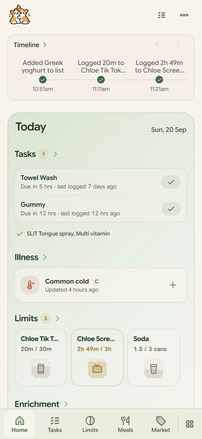
I can log a task or add to a Limit from Home. Today's pickup time is there too, along with the other information I want to check without opening each feature. The screens below show the dashboard as I scroll through it.

Cubby home screen
Pinned routines and limits put what needs doing first.
Cubby home screen showing health, routines, and finance
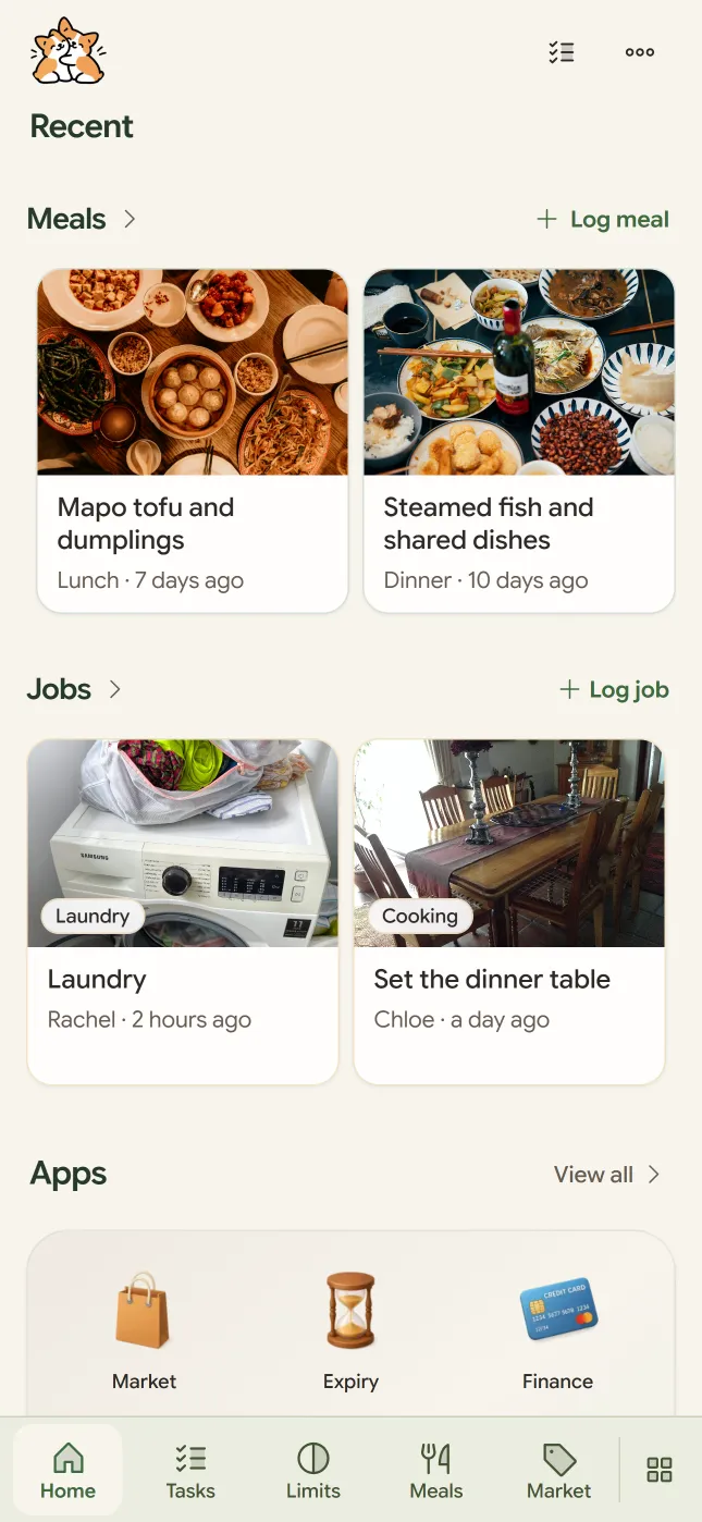
Health, schedules, and finances surface when they need attention.
Cubby home screen showing family moments, meals, and travel
Family moments, meals, and travel stay together in the same scroll.

Routines

recurring upkeep, limits, and schedules

Once I could check when something was last done, I wanted the same record for the routines we repeated as a family.

When did I last do this?

I started with towels because I kept forgetting when I'd last washed them. A dated log was enough for that, but my kid's nasal spray needed more care. The routine changed from daily to every two days, then three, while we also tried to track congestion. Our few Telegram messages left us with very little to tell the doctor.

Each entry now keeps the interval that applied when we logged it. Changing the routine leaves that history intact, so I can look back and see what we were doing at the time.
Cubby tasks

On pace, or already over

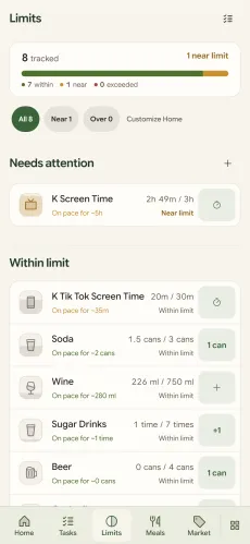
Screen time kept growing, and I wanted to keep an eye on soda and beer too. I gave each habit a weekly limit and a daily pace, so I could check how the week was going while there was still time to do something about it.

Drinks needed unit conversion because a McDonald's small Coke and a can contain different amounts. Seeing the week's allowance nearly gone has talked me out of a drink more than once.

Cubby limits

The same timers, by hand, every day

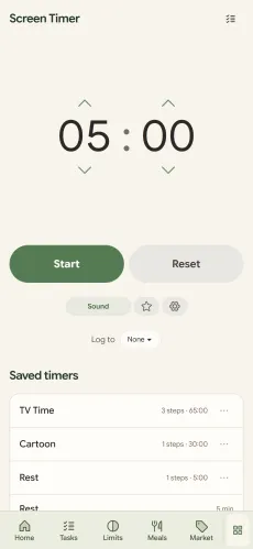
The screen timer gave me a way to connect that weekly limit to what we actually did. YouTube countdowns had fixed durations and sounds, so I built saved profiles with AI voices and ticking sounds that my kid could listen to with his eyes closed.

When a timer finishes, it logs against the limit automatically. That saved a second entry and gave the two features a reason to live in the same app.

Cubby screen timer

The schedule nobody could find

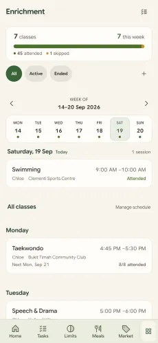
Our kid's classes ended at a different time each day. New terms brought new timings, and make-up sessions went into pinned Telegram messages and emails. We mixed them up often enough to spend quite a bit of time waiting at the door.

I put today's schedule on the dashboard, with make-up sessions marked. Pickup time was something we needed every day, so it belonged on the first screen.

Cubby enrichment schedule

Health

four bodies, one of them a dog

Some records needed more detail than a date. A workout or an illness had to make sense when I came back to it later.

What should I aim for today

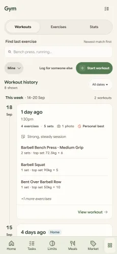
At the gym I mostly went by whatever I remembered from the last session. On cable machines, that meant agar agar the position of the pin. I started logging weights, reps, rest times, and notes on failure or dropsets so I could check the previous set before the next one.

There's also a lock screen for sweaty hands around buttons mid-workout. A new personal record posts to the journal, so it shows up alongside the other things we've been doing.

Cubby gym workout

One log when everyone's sick at once

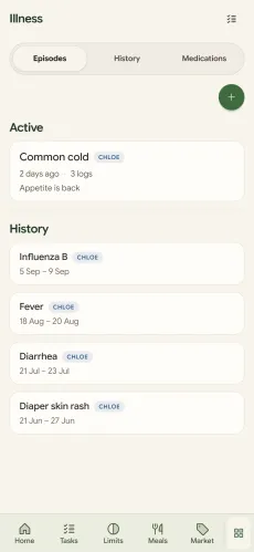
Keeping a routine history helped, but illness needed a record of its own. Temperatures, doses, medicine timings, and MCs were scattered through Telegram, sometimes for several of us at once. By the consultation, the order of events was hard to reconstruct.

I grouped the entries by illness episode so I could read them out to the doctor. It works for me, my wife, our kid, and the dog. Vet visits can be eight to twelve months apart, so I keep the vet's guidance with the episode and pull it up next time.

Cubby illness log

Which brew actually tasted better

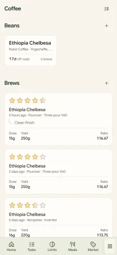
Coffee was a smaller version of the same memory problem. I could recall the last cup or two, so I started saving bean and water weights, timing, and clicks on my Kingrinder K6. A taste rating lets me compare what I actually liked across bags and roasters.

Cubby coffee recipes

Household

what comes in and what runs out

The smaller things stayed too, because I kept running into them at home.

What did we eat yesterday?

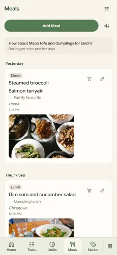
We were just as bad at remembering meals, sometimes even what we'd had that afternoon. Now I log them at the table before we leave, with a photo, so I can look back at what we've eaten over the week.

Cubby meals

The dates that actually matter

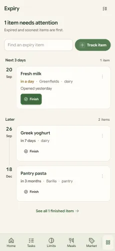
A friend mentioned her cosmetics expiring, which made me think about the milk and soy milk in our fridge. Cubby calculates the expiry from when I open something and how long it keeps. I'm more conscious of how long the milk has left now, even if I don't always keep to it.

Cubby expiry tracker

Which price is actually worth it

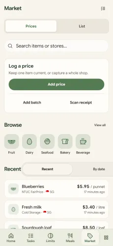
I had a rough sense of supermarket prices, but wine promotions and my Just Wine Club subscription made comparisons harder. I started recording prices by item, shop, and promotion, with unit prices to make different pack sizes comparable. The useful part is knowing which price I'd buy at again.

Cubby market prices

Finance

the dates that cost money

Remembering a date mattered rather more when missing it cost us money.

The fee we couldn't waive

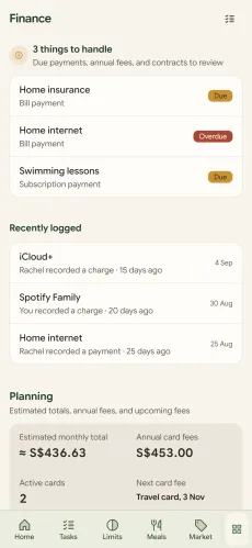
I'd missed credit card bills before and had the charges waived, but my wife's annual fee wasn't waived, and it was expensive. I put card fees, bills, and subscriptions together with their dates so we could check what was coming up.

Cubby finance

Life

the things worth keeping

Once we were using Cubby for the everyday things, I brought in trips and the moments I wanted to keep.

Every trip, scattered everywhere

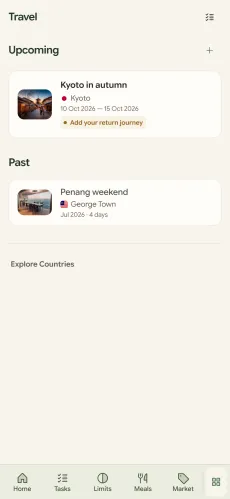
Trips brought a different pile of things to find: emails, Telegram messages, browser tabs, and PDFs, including password-protected insurance documents. I'd already built Roamichi as a travel planner, so I folded it into Cubby. It still needs manual entry and isn't a full itinerary planner, but the trip details are together.

Cubby travel planner

The moments worth keeping

I'd tried recording things my wife did that I appreciated, along with things that frustrated me. I'd gone down a similar path on The Standup Podcast, and a complaint ledger about your spouse felt toxic.

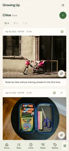
I turned it into a record for our kid: parent-teacher conferences, teacher feedback, naughty moments, and the sweet ones. Those were things I wanted us to remember.

Cubby growing up
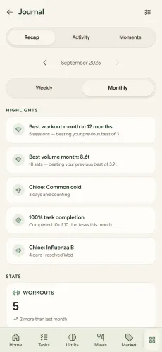
Cubby journal recap

Looking back at the week

The separate trackers feed a weekly and monthly recap. Meals, workouts, and family moments can be read together, which gives us a reason to come back to what we logged.

This is what it adds up to.

This illustration brings the separate features into a household day, from medicine in the morning to the evening routines. Cubby also has a Timeline in the app for recent records and upcoming events.

Choose a track, or scroll across to see all three.

Kid
Family
You

Eat multivitamins

1 multivitamin gummy with breakfast. Logged by Dad so nobody doubles up.

Fresh bedsheets

Changed Sunday routine · Reset for the week without asking who did it.

Cold soda

1 / 2 today

Kopitiam food court

Ate 1 meal at Kopitiam food court (+1 cold barley drink, $14.80). Split into shared food pool.

Sheng Siong run

Dynamo laundry detergent antibacterial 2.5kg ($8.95) · 1 pack of muscat grapes ($2.99).

Finished 1 laundry job

Wash cycle complete · Hung on balcony rack to dry.

Fetch from school after Science enrichment

Picked up from weekend Science lab. Solar experiment kit and workbook packed in bag.

Push workout

Saturday session · Bench press milestone +5 kg personal record.

TikTok screen time

10 min logged

Spray nasal spray

1 spray each side before lights out. Allergy routine kept consistent.

Wash dishes

✓ Done

Designing Cubby by living with it

I use Cubby every day, which means I keep running into my own decisions. Some things I liked when I built them became annoying quite quickly. Others took longer to notice, especially when I was the one who knew how everything worked.

What I reach for every day

Why Home is crowded

I log tasks and limits several times a day, so opening their pages each time became tedious. I wanted the things I did every day within one scroll and one interaction, even if that meant Home was a bit crowded.

That meant some duplication. For a Limit, I wanted enough state to understand the allowance and a quick way to add to it. History and configuration could stay on the Limits page. Tasks on Home could help me act on what needed attention, while the Tasks page kept the larger working set.

I could have made Home a summary with links into each feature, but then I'd keep paying for that tidy structure every time I wanted to log something. I accepted a denser dashboard because I wanted to do the common things where I already was.

See the dashboard

I tried to put too much into the same interaction

I kept coming back to the idea of a common hub for Tasks, Limits and the other logs. They had quite a lot in common underneath, especially timestamps and histories, so it seemed like there should be a way to bring them together. Each attempt mostly felt like I'd put several features next to each other.

Logging a drink takes almost no thought, but a Task might need me to decide whether to do it now or leave it. With an illness, I might want to write quite a bit about what happened.

A Limit also needs to show how the week is going after I add something. An illness entry might need a photo or a medicine dose. I still wanted to reuse code where it helped. I think the shared schema fooled me into thinking the UI should be shared too.

More space for stuff I actually use

At one point, my rough order of use was Tasks, then Limits, Meals, Prices, Illness, Expiry, Gym and Growing Up. That order can change, but there's a long tail of features I use much less often.

I had to get used to giving them uneven amounts of space. Something could be important and still not deserve a permanent Home card. Meanwhile, something completely mundane could deserve a spot right there because I did it several times a day.

Tasks was a useful example. I used it a lot, but because I could do so much from Home, I had less reason to open the Tasks page itself. Another feature might deserve a navigation slot simply because I actually needed to open its page.

Where the data model stopped helping

Just wanted to write a note

I had structured symptoms in the illness tracker because I thought they'd be useful to compare later. But when my son was unwell, I often just wanted to record what I'd noticed. Something like a small ulcer under his tongue the night before, then a painful sore on his foot in the morning, although he otherwise seemed well.

Choosing symptom categories felt like too much work. I could write down what I saw without having to decide exactly what to call it. Temperature and medicine timings were different because those were already specific things I wanted to record.

A photo could help me see how something had changed, while a doctor's note kept what had been assessed or advised. Those were useful things to capture in their own forms. Structured symptoms might still be useful later. But when my son was unwell, categorizing everything while I was trying to record what happened was just annoying.

So I made Note the first action in Add an update, with structured symptoms still available alongside it. I could write the observation down immediately and use the more specific inputs when I needed them.

See the illness feature

Sleepwalking needed somewhere of its own

When I wanted to record sleepwalking, I already had Tasks and Illness in Cubby. It would have been convenient to put the episode into whichever existing feature was closest, but neither felt like a convincing fit. An unusual observation didn't automatically belong in an illness record.

A generic event log would have lost the sleep context too. I wanted to keep an episode with the night it happened, alongside sleep and wake times. Naps and patterns across nights also made more sense together, so Sleep got its own model.

That still left a separate question about where it should appear. Sleep could have its own proper record without automatically earning a card on Home or a prime navigation slot.

Task headings had to help me decide what to do

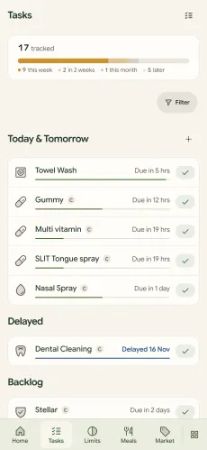
Tasks could have been divided up according to their dates and statuses. But when I opened the page, I was usually working out what to deal with soon and what I'd already let slip. The things I could leave until later needed somewhere to sit too.

I settled on Today & Tomorrow, Delayed, and Backlog. Those headings did some of the interpretation I'd otherwise have to do each time I scanned the dates. I could see the kind of decision I needed to make before reading every item.

Timeline helped me get my bearings

Time was a connection I actually wanted across Cubby. Medicine timings could sit near illness observations, and a day could include meals as well as a workout. I wanted to see what had just happened and what was coming up, which gave Timeline a purpose that the common hub had struggled to find.

I considered making it the main screen, but chronology couldn't decide everything that deserved my attention. An overdue Task or a frequently used Limit could matter more than whichever event happened to come next.

I kept a compact Timeline on Home, with a full view when I wanted more detail. It tells me roughly where we are in the day without turning Home into a chronological feed.

Making room without making a mess

Everything started to look like a card

For a while, a card was the obvious way to contain each thing on Home. It separated the information neatly and made a component easy to move around. But once I had enough of them, the white rounded cards on tinted sections started to look like stickers on coloured paper.

Each card seemed reasonable on its own. Together, they gave too many things the same weight. A small metric could sit directly on its section background, while denser information or a group of related actions still benefited from a container.

So I stopped giving everything its own white box. Related stuff could sit together, and the things that actually needed a container could keep one.

Mobile needed a different arrangement

Limits made this obvious. On desktop, several small items could sit beside each other and save a lot of vertical space. Trying to carry that same arrangement onto a phone made each item cramped, with awkward wrapping that slowed down scanning.

I increasingly preferred a single reading flow on mobile and used the extra width on desktop. The item still needed to be recognizable, and its action had to behave the same way, but its position didn't need to prove that it was the same component.

Household became a category for almost everything

Household started as a useful group, then kept absorbing things because so much of Cubby could plausibly go there. Eventually the label told me very little about what I'd find inside it.

Tasks and Limits were awkward in a different way because they could apply to almost any part of life. I tried groups based on the person, the domain and the purpose of the information, but none gave me a taxonomy that worked everywhere.

Eventually I stopped trying to find one taxonomy that worked everywhere. Home needed groups that were easy to scan, while navigation needed groups that helped me find stuff. The database could organize the same records differently again.

Pin was a Home setting in the wrong place

I initially put a pin control on individual Limits because it seemed convenient to choose one right there. But it became unclear what the pin meant, particularly when the same Limit appeared in different places. Was I changing something in Limits or choosing what appeared on Home?

What I wanted was to choose the Limits in my Home quick log, so I moved that into Customize on the Home section. That gave the setting a clear place to live and let the individual tiles go back to showing the allowance and the add button. I could also remove the old pin behavior from the shared component, which was one less thing to keep around.

See Customize on the current Home screen

Liked the dock until I kept misclicking it

I liked the floating dock when I built it, but I kept misclicking it in actual use. Eventually I went back to a conventional navigation bar with labels, which worked much better. It was a bit annoying to give up something I'd enjoyed building.

I ran into a similar problem when I made create buttons more compact. New task and Add flight became less obvious when I replaced the words with generic icons, so I restored the labels. Moving a page title beside the back button was a better way to save space because I could reclaim a row and still read everything.

A back arrow can stay compact because its meaning is familiar. I'd taken that too far with actions that actually needed words. Now if a label doesn't fit, I try fixing the layout before deleting the label.

See the current navigation in the dashboard screenshots

How it felt after repeated use

Colours matched in code but looked wrong together

Using one colour at different opacities seemed like a tidy way to build the palette. Once I had tinted sections and cards, though, that colour was blending against several different backgrounds.

I ended up with intermediate shades that looked washed out and slightly dirty. There was no single obviously wrong colour, but the whole page had lost some crispness. The variables were consistent while the colours I actually saw weren't.

So I started choosing the actual surface colour I wanted instead of insisting everything come from one neat opacity formula.

Small responses mattered alot

When I add to a Limit, the moving fill shows me that it registered. Haptic feedback helps too, especially when I'm logging something while doing something else and would otherwise have to check the screen again.

Some completions get a brief star effect, and a bigger moment can have confetti. I initially thought of these as polish, but using the same quick actions several times a day made an ambiguous response more annoying than I'd expected. Just felt nicer.

The filled squircle is a good example. Watching the water move connects the action to the allowance I have left, without another message to read. That made the animation useful even before I considered whether I liked how it looked.

Had to be more careful with the celebrations

But recording my kid's temperature would be a strange moment for confetti. The save had succeeded, but someone was still sick. The feedback system now has separate levels, with confetti reserved for milestones. An ordinary save can confirm that the record went through without a celebration.

I also wanted to stop short of points and streaks. There's already enough to keep up with at home, and I wanted the small interactions to feel good without giving us another score to maintain.

Someone else has to want to use it

My wife still says, “You can do it for me”

My wife sometimes says, “You can do it for me.” That's fair enough because we share a household and I can record it for her. But if she keeps finding it easier to tell me than to open Cubby, I have to take that seriously.

I'm a fairly forgiving user of my own app because I know where everything is and why I built it. I already think the information is worth recording. She might find the process troublesome, or she might just get less out of the record than I do.

I'm still figuring that part out. Making a button clearer might help with the first problem, but if keeping Cubby up to date mainly benefits me, it's understandable that she'd rather leave it to me.